Brenda Kerber, the founder and owner of Traveling Tickle Trunk, started out in her field running adult toy parties. She was shocked to discover that many of the products she was selling contained ingredients were not body-safe, were of a poor quality, and would break easily.
She started looking for a company that sold high-quality, safe products that also treated sex in a fun and respectful way (not as a joke). She didn’t find a company that did these things, so she started her own in 2003. Traveling Tickle Trunk is now a fixture in the Whyte Avenue neighbourhood of Edmonton and aims to provide a comfortable, fun, and educational store experience. On the shelves, you’ll find a working demonstration model of every product sold at the store, and the staff encourages you to pick up and check out the products so you can make more informed choices.
Client Goals
- Increase conversion rates from paid campaigns
- Increase in-store visits and sales
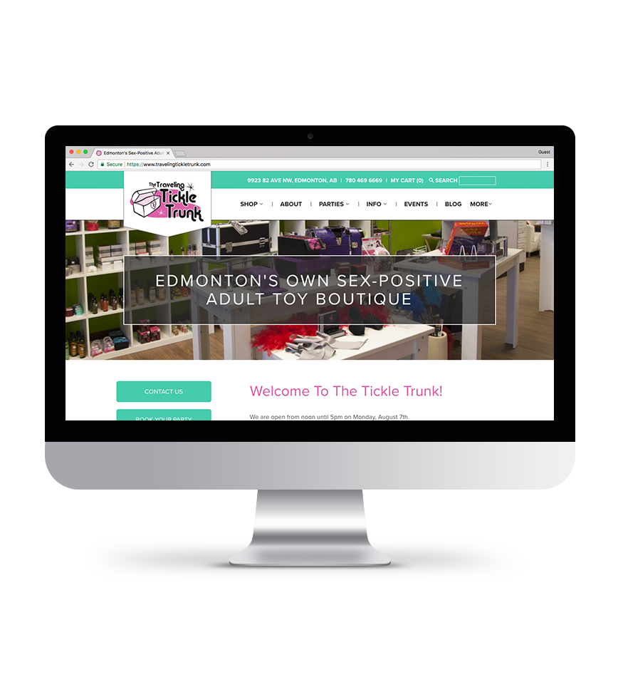
- Bring cohesion to the brand by building an ecommerce website that is as clean and attractive as the physical location
Needs Analysis
We reviewed user journey case studies and Google Analytics to determine the best way to structure the new site. This led to an updated site map that provided a stronger shopper experience. It was also important to migrate Brenda’s Blogspot blog to the new website — we ran into a few issues here, but we’ve resolved them since then.
We went into this project with a comprehensive site migration plan because we wanted to ensure minimal disruption to organic traffic. Achievement, unlocked!

Screen Design & Development
Analytics showed us that a variety of screen sizes were used to view the TTT website, so we focused on overall screen design, instead of limiting ourselves to thinking only in terms of desktop and mobile.
The new Traveling Tickle Trunk site is built on the Shopify platform. We started the project by researching the design of existing Shopify websites. It immediately became apparent that many Shopify sites look very similar — Brenda didn’t want to fall into this trap, and neither did we. With this in mind, we decided to:
- Avoid overloading the home page with sections focused on Deals! and News! and too many other visual elements
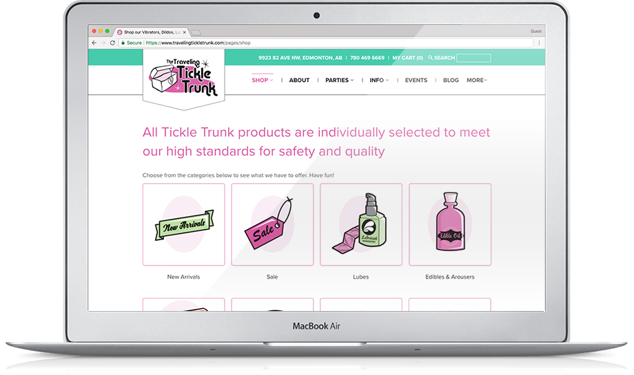
- Use the illustrated icons that existed on the original site to keep the unique, whimsical feel that encompasses Brenda’s brand identity and physical store
- Not include distracting sliders at the top of each page in the Shop section — we’d list all the products immediately instead, to help the user find what they were looking for faster
- Ultimately: keep the interface clean and minimal, with clear links to related areas, such as educational items

The Shop section is the biggest part of the new website, so we wireframed it first. We quickly determined that a fixed top navigation with a drop-down menu containing all the product categories (and subcategories) would provide the quickest way for users to navigate to the product they wanted. We wanted shoppers to clearly know what options they had, so having navigation on the left-hand side of each secondary page, in addition to the top navigation, was important to implement across the entire site.

Once that decision was made, we found that the design of the Shop area informed the rest of the site design. The Events section functioned the same way — shoppers could add tickets to their cart in the same way they added products. Every other section, like the Blog, established consistency for users by continuing to display the left-aligned navigation for blog categories. Comfortable users turn into valuable customers, so focusing on consistency and comfort is key for E-commerce websites.
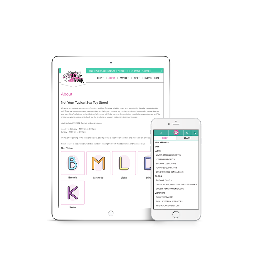
The mobile menu navigation is split into two sections: Shop, which lists all the product categories and subcategories; and Learn, which lists all the other pages of the site. Separating the two gives users quicker access to products upfront, instead of forcing them to tap through two or three pages to get to where they wanted to be. Additionally, the Search function stands out in the right corner, because Search is often the quickest way for users to find what they are looking for.
Limitations
It was difficult to properly redirect Blogspot posts — the redirect code we prefer to use wasn’t working and SHOCKER, Google doesn’t provide any support.
Reflections
This was a fun project for our whole team to get involved in. You never knew what “NSFW” stuff was going to be up on someone’s screen when you walked by!
We’re recently set up Brenda and her team to manage the Traveling Tickle Trunk AdWords campaigns internally. The team is also trained to manage website edits and changes in house at this point as well.
Results
We went into this project with comprehensive site migration plan because we wanted to ensure minimal disruption to organic traffic.
Organic traffic in the 30-days following the launch was up nearly 12% over last year, without any additional off-site SEO work. Site migration = Success!
The real kicker? Since the new website launched, Traveling Tickle Trunk’s e-commerce conversion rate is up by 71% and e-commerce revenue is up by 79%.