When a client comes to us with very specific goals and also understands the value of planning and research, we will build a website that exceeds those goals.
You can also read our case study about this project.
At our first meeting, Fringe Theatre already knew what they wanted from their new website, and then we had to ensure the redesign would also be all that their audience needed it to be.
Fringe Theatre puts on the largest Fringe Festival in North America, the Edmonton International Fringe Festival, each August and delivers theatre programs and community events year-round as well. Fringe Theatre brings artists and audiences together to celebrate creativity, risk, craft, and community.
It was important to the Fringe Theatre team to:
- Sell more tickets online
- Be able to easily update the website themselves
- Integrate the website properly with their chosen ticketing program
- Fix issues caused by a previous agency’s poorly implemented migration
It was important to us to help the Fringe team:
- Introduce more people to “fringing” (more first-time ticket buyers)
- Add new pages to make first-timers’ experiences more enjoyable
- Connect with people attending the Fringe Festival from outside of the city
- Clarify key messaging to avoid alienating people who weren’t already “fringers”
The Build
The open, collaborative environment at Fringe Theatre made it easy for our two teams to work together during the research and planning phase for this project. Fringe fielded all of our (very many) questions patiently and always kept us up-to-date about their plans, hopes, and dreams.
We had to migrate a temporary Squarespace site and a custom CMS site, along with redirecting three different URLs to the new Fringe Theatre WordPress website. The custom CMS was quite old (and still live), while the Squarespace site that was meant to replace that site only had small pieces of the content migrated over properly. In short, things were a mess and cleaning up the previous mishandling was time consuming.
When you are choosing a partner to design and develop your website, please choose one that knows what a migration plan involves!
Technologies
- WordPress
- PHP7
- WP Super Cache
- TablePress
- Advanced Custom Fields
- Gravity Forms
- Isotope/Masonry
- Featherlight
- FastClick
- Google Tag Manager
Key Components
Evergreen vs Festival Content
Most people think of Fringe Theatre as just the festival that happens every August, but the Fringe offers shows and venue rentals all year round. One challenge with the website design and development was providing two states for the website; “Evergreen” (content that is relevant year round) and Festival On (content that is only relevant during the Fringe Festival every August).
Having both Evergreen and Festival content input areas in the site editor makes it easy for content to transfer smoothly into Festival mode during the festival, and then right back to Evergreen mode when the festival ends.
When a visitor is viewing a page on the website, there’s a quick code check to see if the site is in Festival mode. If it is, the code then checks for festival content. If there is none available, the code serves up the Evergreen content. This way, there is no extra work or duplicate effort for pages that do not need specific festival content.


When it’s time for the festival, a single setting is changed in the admin area and the site effortlessly flips into Festival On mode. When the festival is finished, changing the setting again puts the site back the way it was. We made the process as simple as possible!
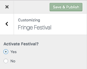
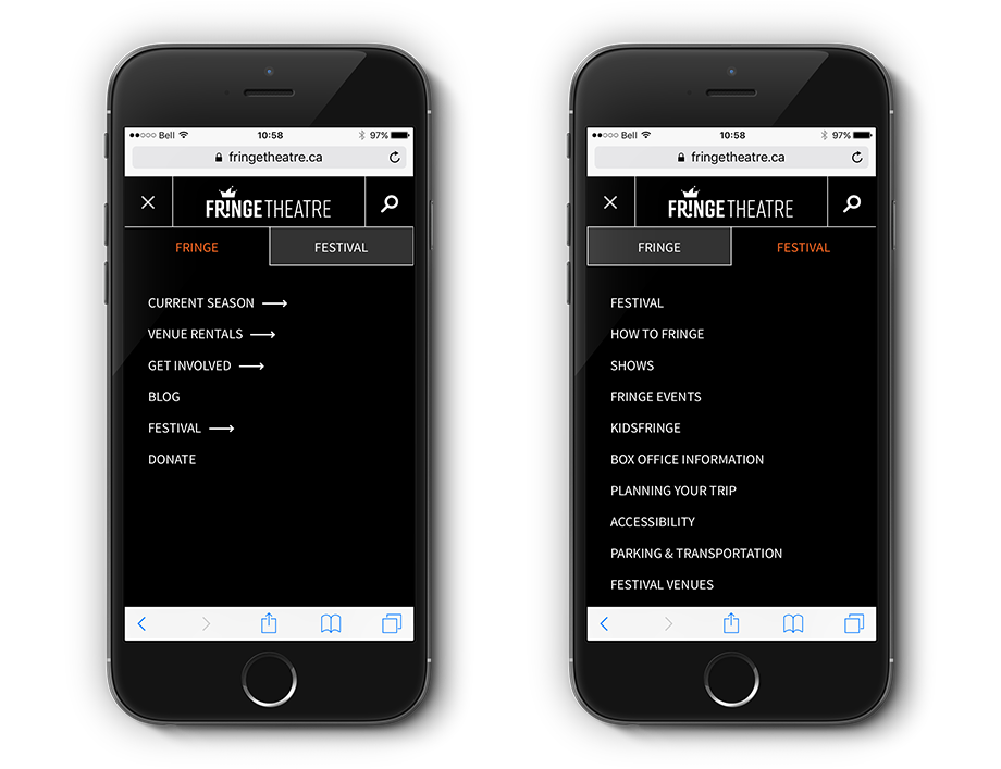
But it isn’t just the page content that changes in Festival On mode, the menu changes as well.
During the Festival, visitors are mostly interested in seeing content related to the Festival. When Festival On mode is activated, the menu order switches and the Festival link becomes prominently positioned. On mobile devices, the Festival tab is active when you open the menu, eliminating a click to find content.


Adding Content to the Site
The Edmonton Fringe Theatre relies heavily on volunteers which has its own set of challenges around knowledge transfer and a general knowledge of WordPress. We kept this in mind when developing the administration area of the website and made sure to provide:
- Lots of on-page explanations
- Content blocks that can be added and easily reordered to control page layout
- Custom templates for pages with extra functionality
- A living document user manual written to address the most common tasks first
The Right Amount of On-page Explanation for Fields
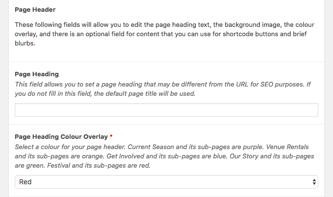
The best documentation is contextual. When you’re doing something, it is much easier to have instructions right in front of you, instead of having to refer to a separate document. Additionally, when information is easily accessible it is way more likely to actually be used.
We wrote very clear instructions and guidelines for fields so that people adding content to the site know exactly how to use the fields they see.
Content Blocks Are Easy to Add and Reorder
Each page has a ‘Layout’ area for adding content blocks. Content blocks can be expandable, basic text content, call-to-action buttons, galleries, and so on. Each content block can be drag and dropped to reorder the content on a page. We focussed on simplicity in the administrative and editor areas of the website so future volunteers could be trained quickly.
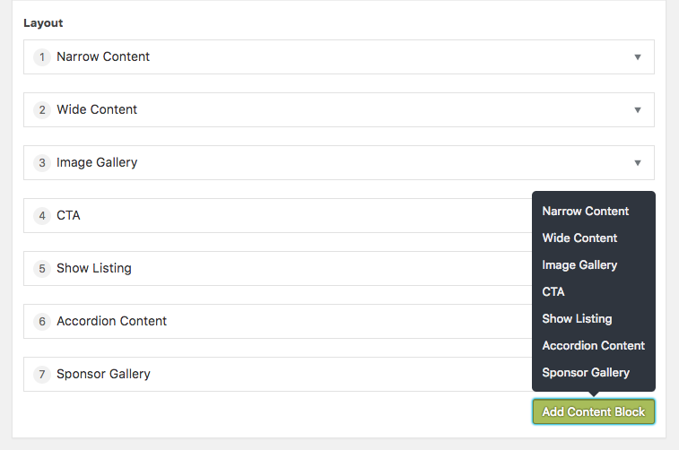
We also made it easy to develop new content blocks because each content block has a separate *.php template file, *.scss file, and *.js file. The same layout section is used on both the Evergreen and Festival tabs for consistency.
Custom Page Templates with Extra Functionality
We built a template just for venue pages that automatically displays the correct form for that page. This makes creating and editing venue pages simpler. For example, if the venue rental form ever needs to be updated, the change happens in just one place and be pushed automatically out to all venue pages.
A Living User Manual
Let’s be honest, user manuals are usually pretty generic, boring, and not the easiest content to digest. They’re often overwhelming until you use them enough to know where the information you need is actually located.
We avoided overwhelming the site editors and made it easy to train new volunteers by writing a user manual that addresses the most common tasks before diving into anything else. We say “living” user manual, because it is a shared Google Doc. Things change, and in the interest of always future-proofing the work we do, we need a way to easily update manuals for our clients.
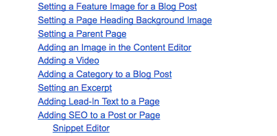
We also included an appendix that goes into detail on the more technical aspects of the site, such as shortcodes. Most people won’t need to read that part, but the information is there for the extra keeners!
Improve The Show Finding Experience
Edmonton Fringe Theatre uses a separate third-party ticketing website that is difficult for visitors to use. We wanted to make finding shows a better experience for fringers (and you know, for ourselves as well). We reached out to the third-party service that handles the ticketing site, which led to the following:
The API Plugin
The ticket provider has a SOAP API that we used to pull show and performance data into the website. As with many APIs, there was a limit to how many times an API can be queried within a given time frame — this prevented us from doing real-time show data pulls. We built our plugin to pull from the API at set intervals and then save the show data to both our database and to a JSON file.
The API plugin was responsible for pulling, storing, and cleaning show, venue, and show data, and also handled the random show picker functionality. Ticket sales were handled by a separate ticketing site.
Search and Filter
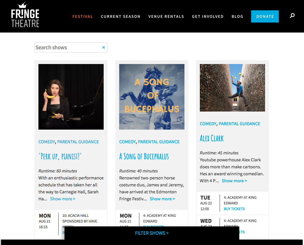
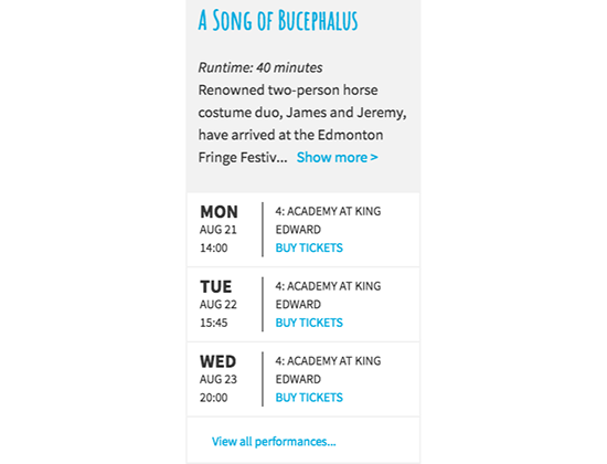
Edmonton’s Fringe Festival has over two hundred shows! That’s a lot of choices to pick through to find the ones you want to see. To make things easier, the Shows page has a search field as well as a slide-up ‘drawer’ with one touch filters that you can apply to the show listing.
Please note: unless the Festival is on, you will not be able to view this functionality live on the Fringe website.
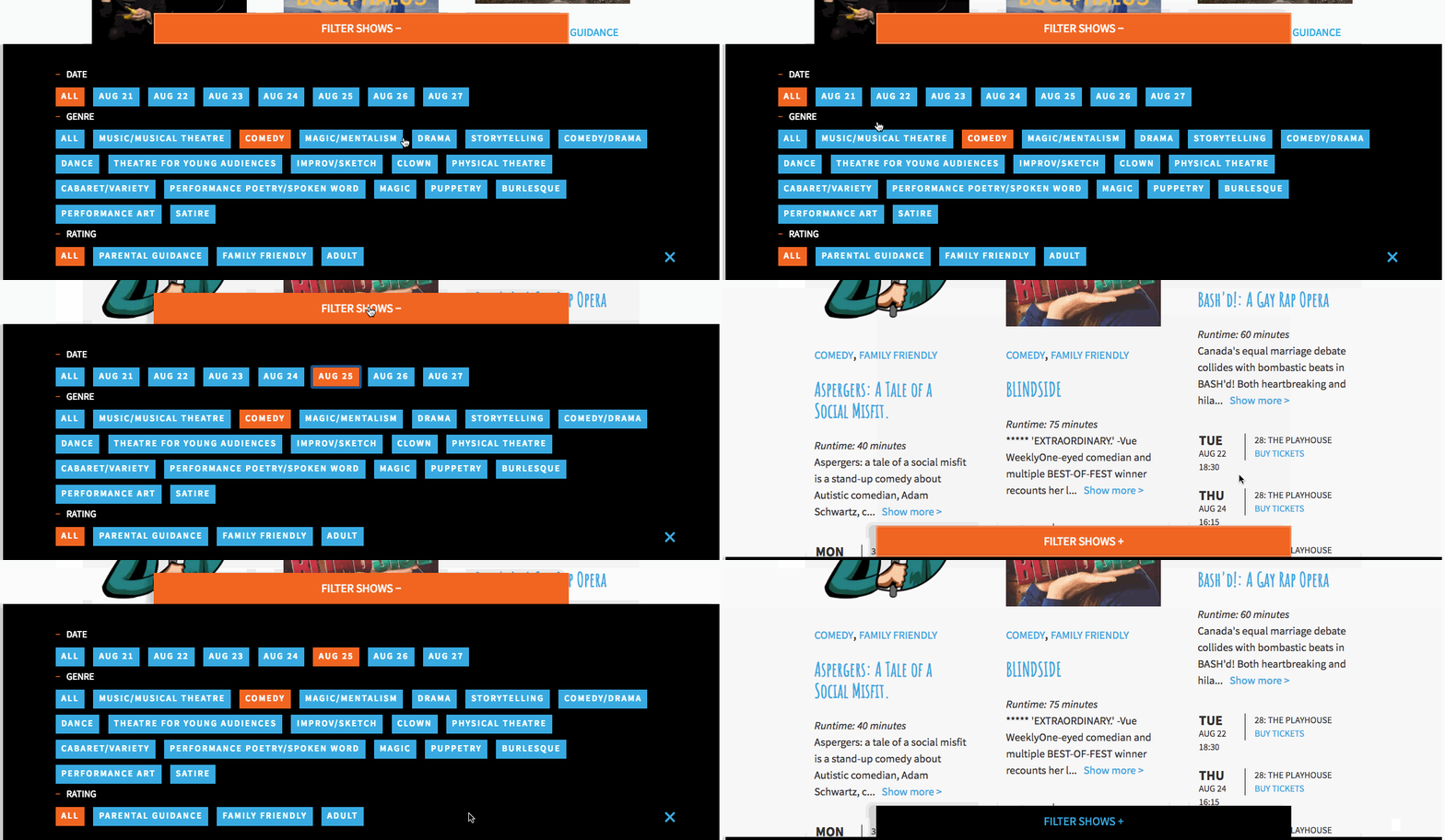
The filter “drawer” had to accomplish an important job — it needed to work on all kinds of device, both in portrait and landscape mode, and be easy for people to understand its purpose and then use.
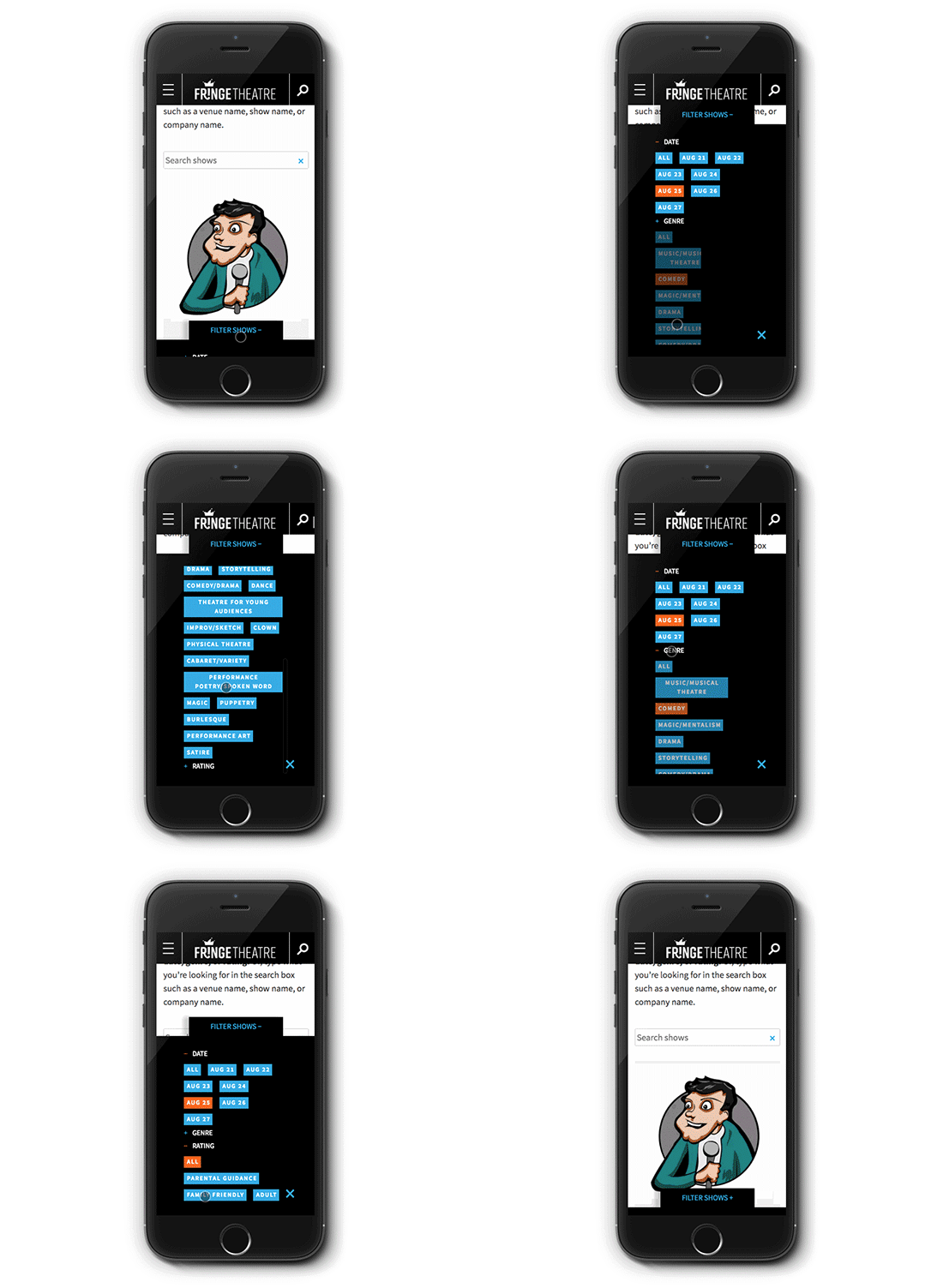
On mobile devices, the filter categories are closed when the drawer is opened. When a category is expanded, the website checks the height of the screen and then scales the size of the drawer to fit. If there are too options in a filter category to fit the screen size, the list of filter options becomes scrollable.
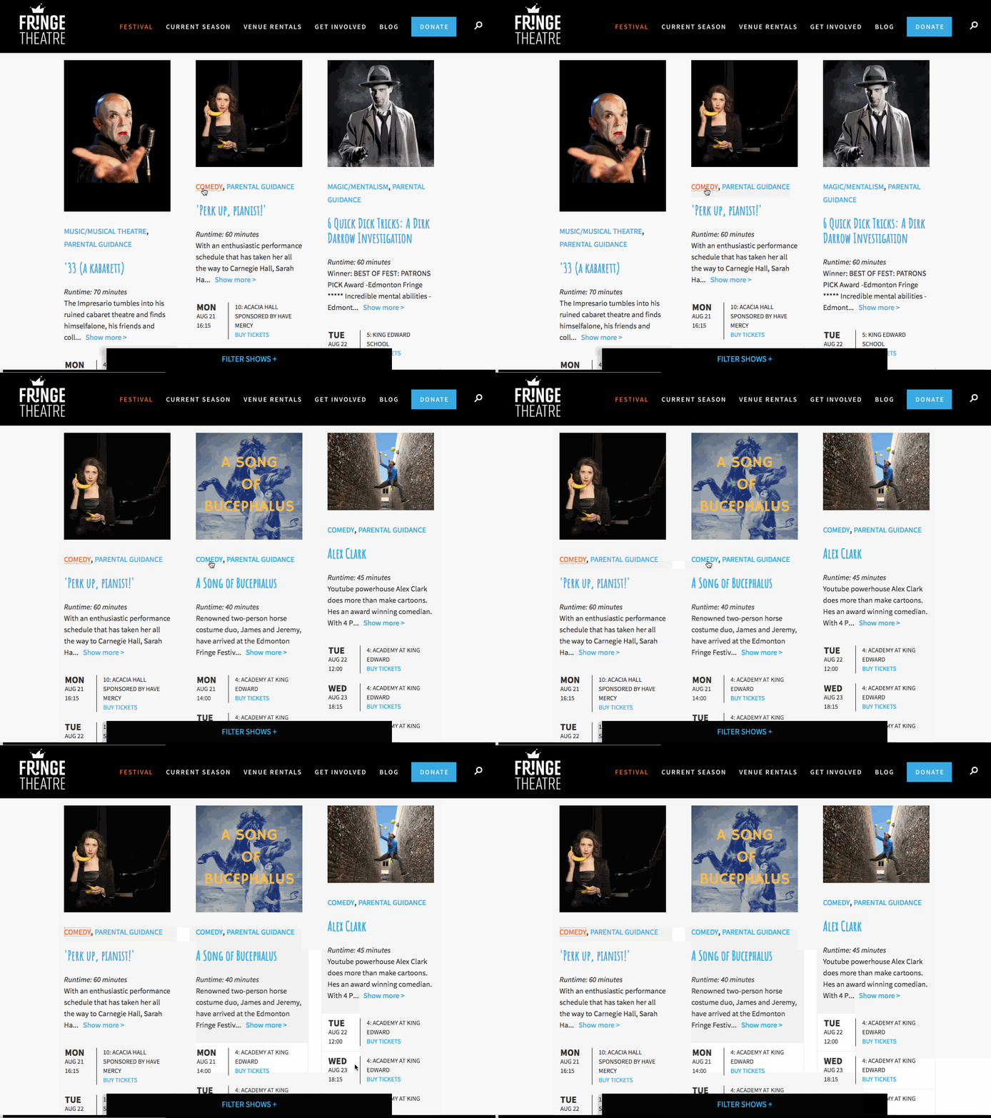
Each show also has filter links for genre listed above the show’s title providing a second way to filter shows.
Random Show Picker
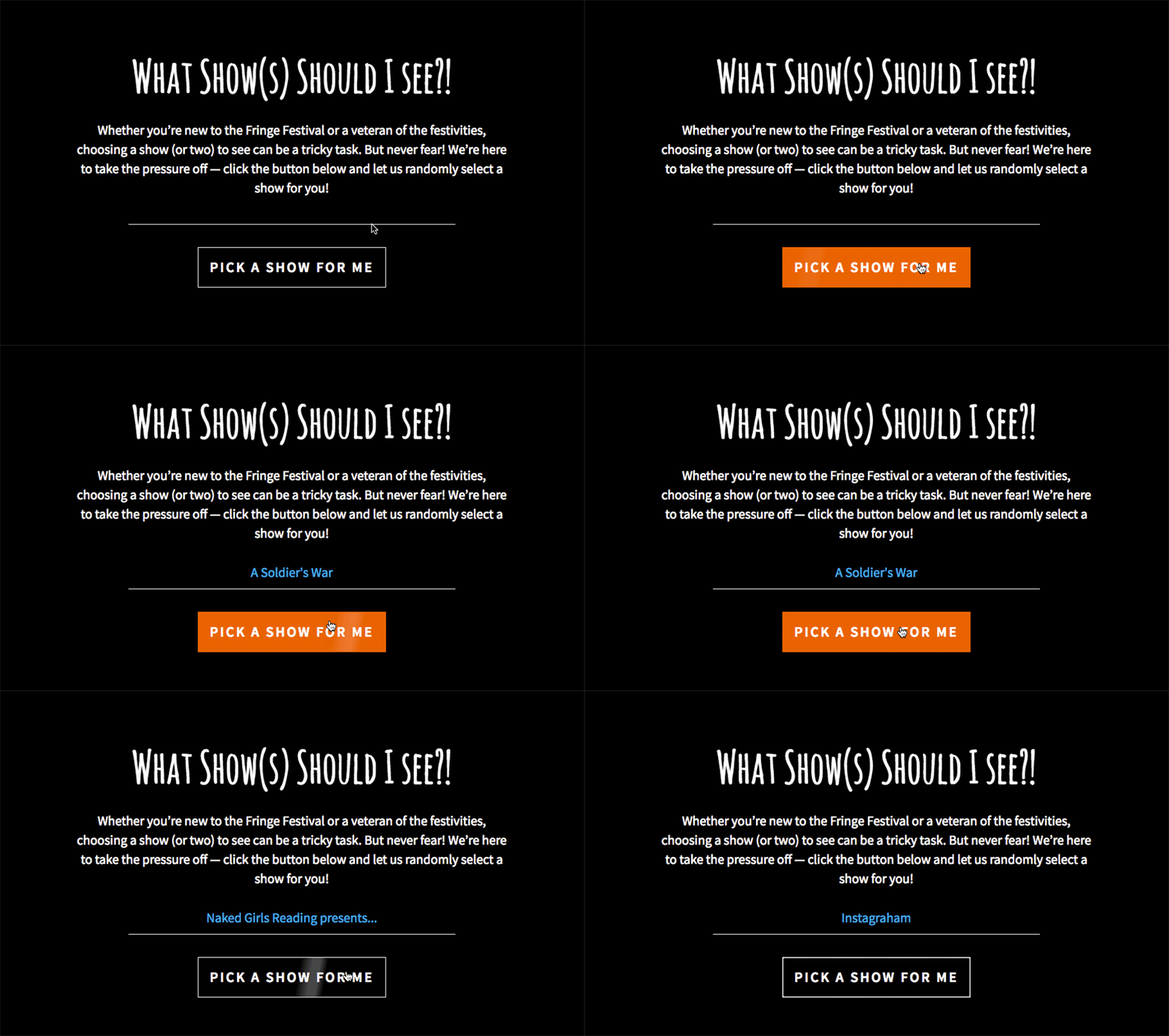
After we thought about how our team had enjoyed fringing in the past, we knew we wanted to build the Random Show Picker! We developed a functional shortcode that uses AJAX to find a random show, then return the name of the show with a link to buy tickets.
We made sure a future performance was scheduled for the randomly selected show so that a person couldn’t get a recommendation for a show that had finished its run.
The Random Show Picker was used 14,379 times during the Festival. How do we know? We used Google Tag Manager to not only record when the Random Show Picker was used but to also record the name of the show that was picked.
Website Performance
You likely know that website performance is a big deal. Google is favouring faster, lighter websites. The Fringe website traffic increases by over 4000% during the festival, so it is very important to keep performance top of mind.
Performance Testing Throughout Development
One of the first plugins we installed in our development environment was Query Monitor. As our developer built the site, she watched how many queries were needed and how fast pages were rendering to find efficiencies that she could build into the website.
Only Load Needed Resources
WordPress themes are typically built to include scripts on every page, regardless of whether or not the script is needed on that page. That can slow down the site, so we built the Fringe theme to make sure that only the necessary scripts load on each page. For example, if a page doesn’t include a gallery, the gallery script won’t load.
The Web Server
Unfortunately we weren’t able to move the Fringe site to a specialized WordPress host this year, so we had to make do with the existing web hosting setup. We switched over to PHP7, used gzip compression, mode_deflate and mod_expires — basically did everything that we could do to improve site performance.
We also reached out to the hosting company to discuss the huge spike in visitors during the Festival. We wanted to know:
- How would they handle the additional traffic? Would they shut the site down if we went over on the bandwidth, or would there be an additional charge?
- Did they have any advice for handling sudden spikes in traffic like this?
When we know that there will be a traffic spike, it is valuable to talk to the hosting company in advance about anticipated server loads. Obviously this isn’t possible in all cases — but we knew in advance what was coming so we were prepared. Even with our advanced planning and preparedness, Fringe visitor numbers blew past our wildest estimations! This was great for Fringe but not so great for their hosting — which was strained for resources. We will be moving their site to a dedicated WordPress host before the 2018 Festival.
Caching
Aside from the server-side changes we made to help with caching, we also installed a caching plugin. Now pages can be served as static HTML, refreshed on a regular basis unless changes are made to a page, in which case a new static HTML page is generated when the changes are saved.
Static HTML renders faster, which means that there is less load on the web server and the web server has more resources to handle traffic spikes.
The 2017 Festival
2017 was a record breaking year for the Fringe Festival! An increase of 8,000 tickets sold from the previous year meant that there were 400 sold out performances and Fringe artists earned more than $1.15 million from ticket sales.
“I’ve never worked with a consulting company that had such incredible attention to detail. I’ve lead four organizational website redevelopments in my career and this is the most sustainable, turn-key product I’ve seen delivered.
They truly considered our organization needs, constraints, and goals, then delivered a phenomenal product that not only solved our problems, but also bridged gaps we didn’t even realized we had. Everything from the back-end system to supporting documentation and training tools were constructed with our team in mind – tailored to meet today’s needs, while also providing a structure from which we can grow and expand.”
— Bobbie O’Connor, Fringe Theatre
The Future
We’re excited to continue working with the Fringe Theatre team to continually improve the site’s performance and increase ticket sales. We’re now armed with detailed analytics from many months of Evergreen mode and two full weeks of Festival mode. We’ve made recommendations for changes and new content pieces to make things even better for ticket buyers during the 2018 Festival!
Did this blog post make you think of an upgrade your organization needs to make? Get in touch with us to plan an investment in your website!
Start Your Project