
Have you ever been reading an article, and after a couple of lines started to skim and then thought about closing the tab — even though you’re really interested in the subject and set out with the intent to read the entire thing?
You can tell the content is written well, and you really want to make it to the conclusion, but something’s preventing you from doing so and you can’t quite put your finger on it…
…could it be that the typographic choices on that website are causing you to stop reading the content? 😱
Readability is about more than just having your content make sense — you can spend a pile of money on a copywriter and check reading levels, but if the layout makes reading difficult you might as well set that money on fire. The right balance between font size and line length is a big difference-maker in the science of readability.
If a font size is too small and the line length too long, readers will have to strain to read the text, which causes their eyes to fatigue. On the other hand, if the font size is too big (making the line length too short), readers are forced to jump to the next line of text too quickly, which — you guessed it — is also hard on the eyes! (You don’t want your audience looking at their screen like this while reading your content.)
The last thing you want is for your website to be referred to as “too hard to read”. Customers and clients make choices quickly when you put them at ease. A comfortable reading experience leads visitors to a) easily read your content, and b) make decisions faster.
Line length & font size

Making things as easy as possible to read isn’t a new concern — for years typographers have said 65 characters per line is the perfect line length (or “measure”) for print. However, it’s 2018, so let’s embrace our digital-first way of life. Here is the golden rule to keep in mind for web typography:
45 to 80 characters (per line) is the ideal line length for text on websites.
The final number of characters per line depends on the font, but so long as your content is falling within the above parameters, you’re making it as easy as possible for visitors to read your content.
For evidence of this line length in action, look at one of the most popular sites for publishing: Medium. With a maximum of around 80 characters per line (and a healthy font size of 21px on large screens), Medium ensures extreme readability and comfort.
What about the size of the font?

Line length and font size work together to create an optimal reading experience — the font size must also be large enough to be easily read. What’s the point of using a proper line length of 60 characters if your body text is set to the same size used for side-effects on prescription drug packaging? (There’s a reason those side-effects are shown in such small print — it’s because they’re trying to discourage people from reading them.)
Your base font size (for large screens) should be somewhere in the range of 18px to 26px.
However, you can’t just increase the font size on your website, pat yourself on the back and be done with it. We have to consider endless screen sizes, large and small!

Larger font sizes typically look strange on smaller screens, because they take up too much real estate. This creates an uncomfortable reading experience because lines of text get cut off too quickly, forcing readers to slow down.
A smaller font size must be delivered on smaller screens.
To keep the line length of the text in that desired 45–80 character per line range, the font size needs to be reduced on the smallest screens (i.e. mobile devices). Using a smaller font size on small screens won’t shock visitors to your site, as people typically hold their phones and tablets closer to them when reading.
Enter: Fluid Type
The great thing is we can use fluid type to achieve this change in font size! Fluid typography resizes smoothly to match any device width, meaning we can present a larger font size on larger screens and a smaller font size on smaller screens — and adjust for all screen widths in between.
For example, our website displays the body copy at 21px on large screens and 16px on small screens. In between those two extremes, the font size will adjust proportionally to the size of the window or screen it is being viewed on — which is where the “fluid” part of the name comes in.
Example: Wikipedia
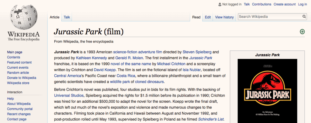
Wikipedia is a great resource, but unfortunately on large screens it typically provides a subpar reading experience. In the screenshot above, the line-length is as long as 104 characters, and the font size is only 14px!
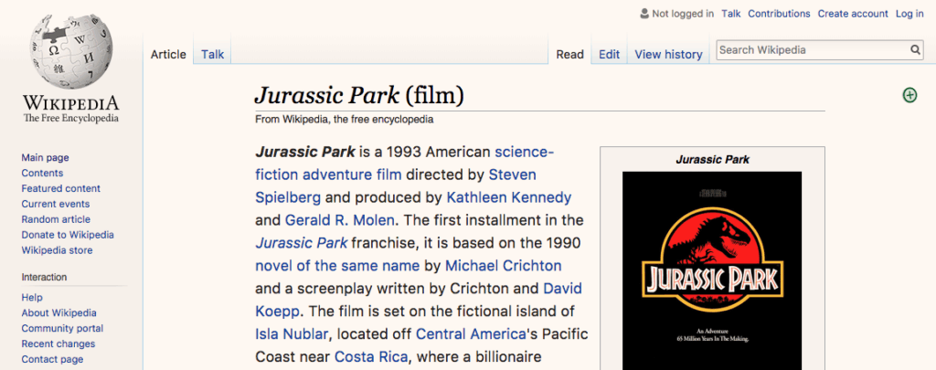
Using “Skinny” — a Google Chrome extension which limits the width of any web page to improve website readability on large screens — we can see how much easier it is to read a Wikipedia article with a line length of 50 characters and a font size of 18px.
What about the space between the lines?

Line height (the vertical space between lines of text, also known as “leading” or “line spacing”) is important as well.
Much like line length and font size, line height also affects how people read. If it’s too tight, the lines of text become hard to scan. Too loose and the lines of text appear to be unrelated to each other, which is confusing for readers!
The perfect line height depends on the design and size of the font itself. There is no magic number that works for all text (although it’d be cool if there was!).
A line height of 1.5 times the font size is a good place to start from, and then you can adjust accordingly.
Don’t try to do this all alone. Have other members of your team take a look at different line heights to get their opinion on what is the most comfortable to read!
Keep in mind that smaller text typically needs more line height, not less. This is because people scan horizontally and vertically when reading and a line height that is too small (also called too tight) makes people jump over sections. For example, our body text has a line height of 1.6x the font size, but our larger header text has a line height of 1.3x.

Line length + font size + line height = comfortable reading
Although it might seem like a small thing to consider, paying attention to (and improving) the design of the text on your website is an impactful way to remove many of the obstacles people face when reading online content.
People don’t like to struggle: provide your customers and clients with a comfortable reading experience, and they’re more likely to give you more of their time.
There are many other things to consider when choosing the typography of your website (font choice, font colour, hierarchy, etc.) but creating the right balance between font size and line length will be a difference maker in getting your clients and customers to actually read your content.
People need to read what you have to say to understand why they should contact you. Remove as many barriers as you can! Make people as comfortable as they can possibly be. People like ‘easy’ and it’s up to you to give ‘easy’ to them.
______________
If you want to dive into even deeper typographic waters, be sure to check out Butterick’s Practical Typography Guide — the “Typography in Ten Minutes” section is a great place to start!